What is a Line Graph
Line graph is a type of graph which displays information as a series of data points called “markers” connected by a straight line segment.
Commonly a Line Graph is used often used to visualize a trend in data over intervals of time series. This compares two variables which is plotted along x axis.
To better understand, see sample below

Shown in the illustration is the Monthly Expenditure of Jim through a line graph.
The months from March to August is the time line which represents the x – axis, while the amount of money is the y – axis.
This line graph illustrated the amount of money that is spent for a month. And the purple line represents the line series for each month.
This graph depicts if such expenditure is rising or falling.
A line graph cannot be plotted without two variables. These two variables are different from each other.
It could be time against age, money against time, time against height or time against weight. To help you know how to plot this two variables in a line graph lets look at the sample below:
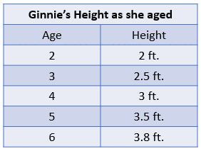
Shown as a sample is a comparison of two variables between Ginnie’s age and her height.
Using the information, draw a line graph to represent the increase of her height as she aged.
Follow the steps below to help you.
First, draw a graph.
The x – axis (Horizontal line) represents the age, and the y – axis (vertical line) to represent the height.
A sample is shown on the right


Plot the 1st point, with age 2 and height of 2, (2, 2) is called the vertices, which meets at a certain point.
Then plot all the other given items.
The red mark indicates the points.
After plotting all the details corresponding to height and age, you will see a result like this.
The five red marks represents the five vertices (2,2), (3, 2.5), (4, 3), (5, 3.5) and (6, 3.8).


Then connect all the dots to form a line rising to the right.
And here is your final line graph.
Using the line graph, we can interpret that at the age of 6, she reached her highest right of 3.8 ft.
To understand more and to help you analyze line graphs, here are other examples for you.
Shown is the line graph of push-ups done by boys in a week.
Using the line graph, we can conclude that most boys do maximum push-ups on Saturday, while they have least number of push-ups on Sundays and Tuesday


Shown in the illustration is a line graph of monthly rainfall.
From April to July, the heaviest rainfall is April, while the least rainfall was on July.
The heaviest rainfall reaches 6 inches, while the least only reached 1 inch.
Test your knowledge on Line Graphs
Based on the below line graph example take a short quiz

Are you ready to practice more, why not join us and take the test on line graphs